GSP622

Overview
Data Studio allows you to unlock the power of your data with interactive dashboards and beautiful reports that inspire smarter business decisions.
With Data Studio, you can:
-
Connect: Easily access a wide variety of data. With built-in and partner connectors, you can connect to virtually any type of data stream.
-
Visualize: Turn your data into compelling stories of data visualization art. You can quickly build dashboards with Data Studio's web-based reporting tools.
-
Share: Share your reports and dashboards with individuals, teams, or the world. Collaborate in real time. Embed your report on any page.
In this lab, you create data visualizations with Data Studio. You first explore a sample Google Cloud billing data in BigQuery — Google's serverless, highly scalable enterprise data warehouse that is designed to make data analysts more productive with unmatched price-performance. After running a few SQL queries on your billing data, you export those metrics to Data Studio, where you explore the service's chief features and build your own billing data visualizations.
What you'll learn
In this lab, you learn how to:
- Explore exported billing data in BigQuery.
- Run SQL queries to better understand a project's consumption of Google Cloud services.
- Export queried data to Data Studio.
- Explore Data Studio tools and generate visualizations with your queried data.
Once you're ready, scroll down and follow the steps below to get your lab environment set up.
Setup and requirements
Before you click the Start Lab button
Read these instructions. Labs are timed and you cannot pause them. The timer, which starts when you click Start Lab, shows how long Google Cloud resources are made available to you.
This hands-on lab lets you do the lab activities in a real cloud environment, not in a simulation or demo environment. It does so by giving you new, temporary credentials you use to sign in and access Google Cloud for the duration of the lab.
To complete this lab, you need:
- Access to a standard internet browser (Chrome browser recommended).
Note: Use an Incognito (recommended) or private browser window to run this lab. This prevents conflicts between your personal account and the student account, which may cause extra charges incurred to your personal account.
- Time to complete the lab—remember, once you start, you cannot pause a lab.
Note: Use only the student account for this lab. If you use a different Google Cloud account, you may incur charges to that account.
How to start your lab and sign in to the Google Cloud console
-
Click the Start Lab button. If you need to pay for the lab, a dialog opens for you to select your payment method.
On the right is the Lab setup and access panel with the following:
- The Open Google Cloud console button
- The temporary credentials (username and password) that you must use for this lab
- Other information, if needed, to step through this lab
Note that the lab timer is located near the top of the page, showing the remaining time.
-
Click Open Google Cloud console (or right-click and select Open Link in Incognito Window if you are running the Chrome browser).
The lab spins up resources, and then opens another tab that shows the Sign in page.
Tip: Arrange the tabs in separate windows, side-by-side.
Note: If you see the Choose an account dialog, click Use Another Account.
-
If necessary, copy the Username below and paste it into the Sign in dialog.
{{{user_0.username | "Username"}}}
You can also find the Username in the Lab setup and access panel.
-
Click Next.
-
Copy the Password below and paste it into the Welcome dialog.
{{{user_0.password | "Password"}}}
You can also find the Password in the Lab setup and access panel.
-
Click Next.
Important: You must use the credentials the lab provides you. Do not use your Google Cloud account credentials.
Note: Using your own Google Cloud account for this lab may incur extra charges.
-
Click through the subsequent pages:
- Accept the terms and conditions.
- Do not add recovery options or two-factor authentication (because this is a temporary account).
- Do not sign up for free trials.
After a few moments, the Google Cloud console opens in this tab.
Note: To access Google Cloud products and services, click the Navigation menu or type the service or product name in the Search field.
Task 1. Explore billing data in BigQuery
In this task, you run SQL queries in BigQuery to see what information is available in the billing data, which was automatically exported into BigQuery when the lab was spun up.
There are four Google Cloud projects identified within this billing data:
- CTG - Storage
- CTG - Dev
- CTG - Prod
- CTG - Sandbox
These four Google Cloud projects illustrate a common enterprise schema, where you have different projects for development, production, storage, and sandbox testing.
Open the BigQuery console
- In the Google Cloud Console, select Navigation menu > BigQuery.
The Welcome to BigQuery in the Cloud Console message box opens. This message box provides a link to the quickstart guide and the release notes.
- Click Done.
The BigQuery console opens.
Run a query to review the data
- In the Query Editor, copy and paste the following query, and then click Run:
SELECT * FROM `qwiklabs-resources.bigquery_billing_export.gcp_billing_export_v1_01150A_B8F62B_47D999` LIMIT 1000
SELECT * returns all column values from a specified table, and LIMIT 1000 returns only 1000 records from the table, which contains around 3 million records.
You should see the resulting table in the Query results section.
Click Check my progress to verify the objective.
Explore your billing data in BigQuery.
Answer the following questions
- Inspect the table (be sure to scroll left and right) and answer the following questions so you become more familiar with this data:
You found the answers to these questions by looking at the BigQuery table results from your first SQL query. For more complicated questions, you would run more complicated SQL queries to analyze your data and gain valuable insights.
Task 2. Create data visualizations for service type usage with BigQuery and Data Studio
In this task, you use BigQuery to answer specific questions regarding service types in the billing data.
You want to know which service types are most and least used, so you need to determine:
- What types of services the four projects use
- Which service types are most and least used
To answer these questions, you run SQL queries on the billing data hosted in BigQuery. You then use Data Studio to build reports with data visualizations to share those insights.
Note:
The billing data provided in this lab is dynamic, so the number of logs and rows in the table will be different. Your query and console outputs may be different from the images in the lab instructions.
Query to identify service types
-
In the Query editor, clear the current query.
-
In the Query editor, type the following, and then click Run:
SELECT service.description FROM `qwiklabs-resources.bigquery_billing_export.gcp_billing_export_v1_01150A_B8F62B_47D999` GROUP BY service.description
This query reveals which service is associated with each log.
The service.description column tells you what Google Cloud service is associated with each log. The GROUP BY keyword aggregates result-set rows that share common criteria (in this case the service description) and returns all of the unique entries found for such criteria.
In the Query results section, in the Results tab, you see that the four projects use 15 different types of Google Cloud services.
Click Check my progress to verify the objective.
Run the query to get service.description column values.
Query to find which service types are most and least used
-
In the Query editor, clear the current query.
-
In the Query editor, type the following, and then click Run:
SELECT service.description, COUNT(*) AS num FROM `qwiklabs-resources.bigquery_billing_export.gcp_billing_export_v1_01150A_B8F62B_47D999` GROUP BY service.description
This query determines which service types are most and least used.
The COUNT(*)function returns the number of rows that share the same criteria (in this case the service description).
BigQuery shows your results in the Query results section in a table with two columns: description and num. Compare the numbers in the num column to determine which service type was the most and least used.
Click Check my progress to verify the objective.
Run the query to find out which services are used the most and least.
Create a Data Studio visualization for service usage
-
Open Data Studio in a new tab.
-
Click Create > Report.
-
Select Country and Enter Company name.
-
Agree to the Terms of Service, and then click Continue.
-
In email preferences, select No for all.
-
Click Continue.
-
In the Add data to report pane, click Connect to data.
-
In the Google Connectors window, select BigQuery.
-
Click Authorize.
If prompted, select the username for this lab: .
-
Under Recent Projects, select Custom Query.
-
In Billing Project, select your project ID:
-
In the Enter Custom Query pane, paste the query you ran previously in BigQuery:
SELECT service.description, COUNT(*) AS num FROM `qwiklabs-resources.bigquery_billing_export.gcp_billing_export_v1_01150A_B8F62B_47D999` GROUP BY service.description
-
Click Add.
-
Click Add to report.
-
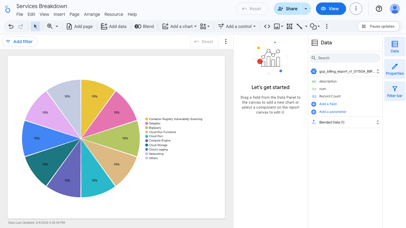
Click Untitled Report, and rename this report as Services Breakdown.
-
Click Add a Chart, select the Pie chart, and click once on the empty canvas to add the pie chart.
Data Studio generates a pie chart on the use of services.
-
In the Setup pane, click Blend data.
-
In Blend Data console, in the Metrics section (left panel), hold the pointer over Record Count, and click X to remove that metric.
-
Click Add metric, and select num.
You may have to scroll down to see the num menu option.
-
Click Save, then click Close.
-
Click Data Studio  in the top left.
-
To see the visualization you just created, click Services Breakdown.
-
Close the Data Studio browser tab and return to the BigQuery console browser tab.
You are now ready to proceed to the next task to answer different questions.
Task 3. Create data visualizations for region usage with BigQuery and Data Studio
In this task, you use BigQuery to answer specific questions regarding region usage in the billing data.
You want to know which regions are most and least used, so you need to determine:
- Which regions the Google Cloud services ran in
- Which regions are most and least used
To answer these questions, you run SQL queries on the billing data hosted in BigQuery. You then use Data Studio to build reports with data visualizations to share those insights.
Note:
The billing data provided in this lab is dynamic, so the number of logs and rows in the table will be different. Your query and console outputs may be different from the images in the lab instructions.
Query to determine which regions the Google Cloud services ran in
-
In the Query editor, clear the current query.
-
In the Query editor, type the following, and then click Run:
SELECT location.region FROM `qwiklabs-resources.bigquery_billing_export.gcp_billing_export_v1_01150A_B8F62B_47D999` GROUP BY location.region
The results are a single region column that lists the regions the Google Cloud service ran in. A null region means the region is not known.
Click Check my progress to verify the objective.
Run the query to get the region that the Google Cloud service ran in.
Query to determine which regions are used the most and least
-
In the Query editor, clear the current query.
-
In the Query editor, type the following, and then click Run:
SELECT location.region, COUNT(*) AS num FROM `qwiklabs-resources.bigquery_billing_export.gcp_billing_export_v1_01150A_B8F62B_47D999` GROUP BY location.region
Your results are two columns, region and num. Compare the results to determine which regions are most and least used.
Click Check my progress to verify the objective.
Run the query to find out which regions are used the most and the least by a service.
Create a Data Studio visualization for regions
-
Open Data Studio in a new tab.
-
Click Create > Report.
-
In the Add data to report pane, click Connect to data.
-
In the Google Connectors window, select BigQuery.
-
Under Recent Projects, select Custom Query.
-
In Billing Project, select your project ID:
-
In the Enter Custom Query pane, paste the query you ran previously in BigQuery:
SELECT location.region, COUNT(*) AS num FROM `qwiklabs-resources.bigquery_billing_export.gcp_billing_export_v1_01150A_B8F62B_47D999` GROUP BY location.region
-
Click Add.
-
Click Add to report.
-
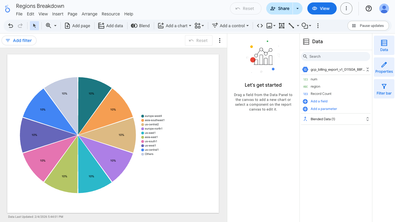
Click Untitled Report, and rename this report to Regions Breakdown.
-
Click Add a Chart, select the Pie chart, and click once on the empty canvas to add the pie chart.
Data Studio generates a pie chart on the use of services.
-
In the Setup pane, click Blend data.
-
In Blend Data console, in the Metrics section (left panel), hold the pointer over Record Count, and click X to remove that metric.
-
Click Add metric, and select num.
You may have to scroll down to see the num menu option.
-
Click Save, then click Close.
-
Click Data Studio in the top left.
-
To see the visualizations you just created, click Regions Breakdown.
Congratulations!
In this lab, you explored and queried billing data previously exported to BigQuery. After exploring the data with SQL queries, you exported your aggregated data to Data Studio, where you generated pie chart visualizations of service and region consumption.
Next steps / Learn more
Google Cloud training and certification
...helps you make the most of Google Cloud technologies. Our classes include technical skills and best practices to help you get up to speed quickly and continue your learning journey. We offer fundamental to advanced level training, with on-demand, live, and virtual options to suit your busy schedule. Certifications help you validate and prove your skill and expertise in Google Cloud technologies.
Manual Last Updated May 18, 2026
Lab Last Tested March 31, 2026
Copyright 2026 Google LLC. All rights reserved. Google and the Google logo are trademarks of Google LLC. All other company and product names may be trademarks of the respective companies with which they are associated.