

시작하기 전에
- 실습에서는 정해진 기간 동안 Google Cloud 프로젝트와 리소스를 만듭니다.
- 실습에는 시간 제한이 있으며 일시중지 기능이 없습니다. 실습을 종료하면 처음부터 다시 시작해야 합니다.
- 화면 왼쪽 상단에서 실습 시작을 클릭하여 시작합니다.
Create views in BigQuery
/ 50
Create a BigQuery data source in Looker Studio
/ 50

Looker Studio helps you to unlock the power of your data through customized data visualizations and reports from a variety of data sources. You can share these visualizations and reports with specific stakeholders or publicly.
In this lab, you learn how to use Looker Studio to visualize data stored in BigQuery using historic information about internal flights in the United States from the US Bureau of Transport Statistics.
In this lab, you learn how to perform the following tasks:
Read these instructions. Labs are timed and you cannot pause them. The timer, which starts when you click Start Lab, shows how long Google Cloud resources are made available to you.
This hands-on lab lets you do the lab activities in a real cloud environment, not in a simulation or demo environment. It does so by giving you new, temporary credentials you use to sign in and access Google Cloud for the duration of the lab.
To complete this lab, you need:
Click the Start Lab button. If you need to pay for the lab, a dialog opens for you to select your payment method. On the left is the Lab Details pane with the following:
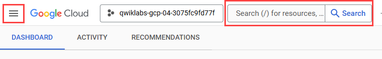
Click Open Google Cloud console (or right-click and select Open Link in Incognito Window if you are running the Chrome browser).
The lab spins up resources, and then opens another tab that shows the Sign in page.
Tip: Arrange the tabs in separate windows, side-by-side.
If necessary, copy the Username below and paste it into the Sign in dialog.
You can also find the Username in the Lab Details pane.
Click Next.
Copy the Password below and paste it into the Welcome dialog.
You can also find the Password in the Lab Details pane.
Click Next.
Click through the subsequent pages:
After a few moments, the Google Cloud console opens in this tab.
This lab uses a BigQuery dataset that has been pre-loaded with two months of sample flight data for January and February 2015, which was obtained from the US Bureau of Transport Statistics. The flight data is in a table called flights_raw in the dsongcp dataset.
The Welcome to BigQuery in the Cloud Console message box opens. This message box provides a link to the quickstart guide and the release notes.
The BigQuery console opens.
You can close the Check out what's new in Studio screen.
In this section, you explore the source table to see how the data is structured and the values contained, before creating new views from the source table.
In the Explorer pane, expand your project ID (
In the new pane for the flights_raw table, if it isn't open by default, click the Schema tab to see the schema of the flights_raw table.
Click Preview to view the columns and values in the flights_raw table.
In this section, you create new views to easily see flights that are delayed by 10, 15, and 20 minutes respectively. In subsequent tasks, you use these views in Looker Studio to create visualizations.
Switch to the Untitled query tab to prepare to create a new query.
Copy and paste the following query, and click Run.
This query formats the original data values and column names in the source flights_raw table and saves the results to a new view named flights.
Click + (SQL query) to create a new query.
Copy and paste the following queries, and click Run.
These queries select data from the new view named flights based on departure delay times and saves the results to new views.
In a new browser tab, open Looker Studio.
If needed, click Use it for free, and click Not now on the Get Looker Studio Pro message.
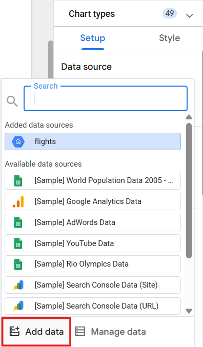
Click Data sources in the top menu.
On the top left, click + Create > Data source.
Select a Country and provide a Company name.
Agree to the Terms of service and click Continue.
Select No for all email preferences, then click Continue.
In the list of Google Connectors, click the BigQuery tile.
Click Authorize to enable access from Looker Studio to your Cloud sources.
If needed, be sure your lab account (
Click to select My projects >
Click the blue Connect button on the upper right of the screen.
Click Create report at the top right of the page.
Click Add to report to confirm that you want to add the flights table as a data source.
Click Freeform layout.
Replace Untitled Report in the top left with your name for this report such as Flight Delays.
Since you'll create your own charts, click to select it, then delete the automatically created chart.
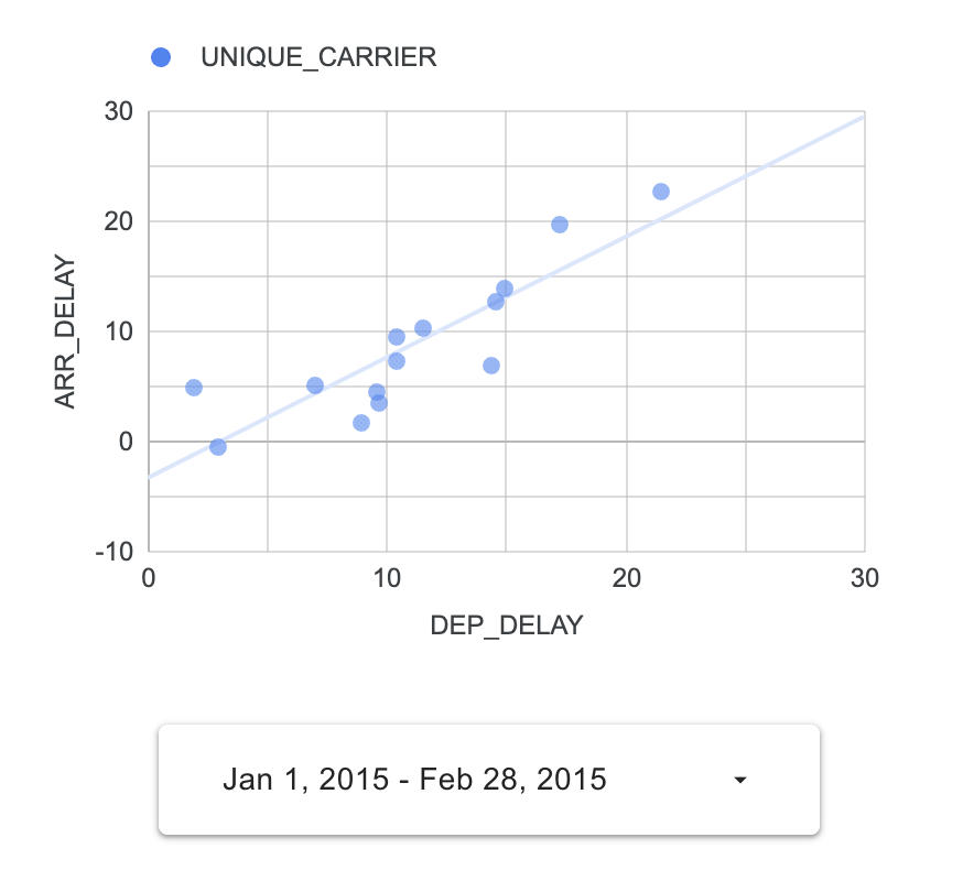
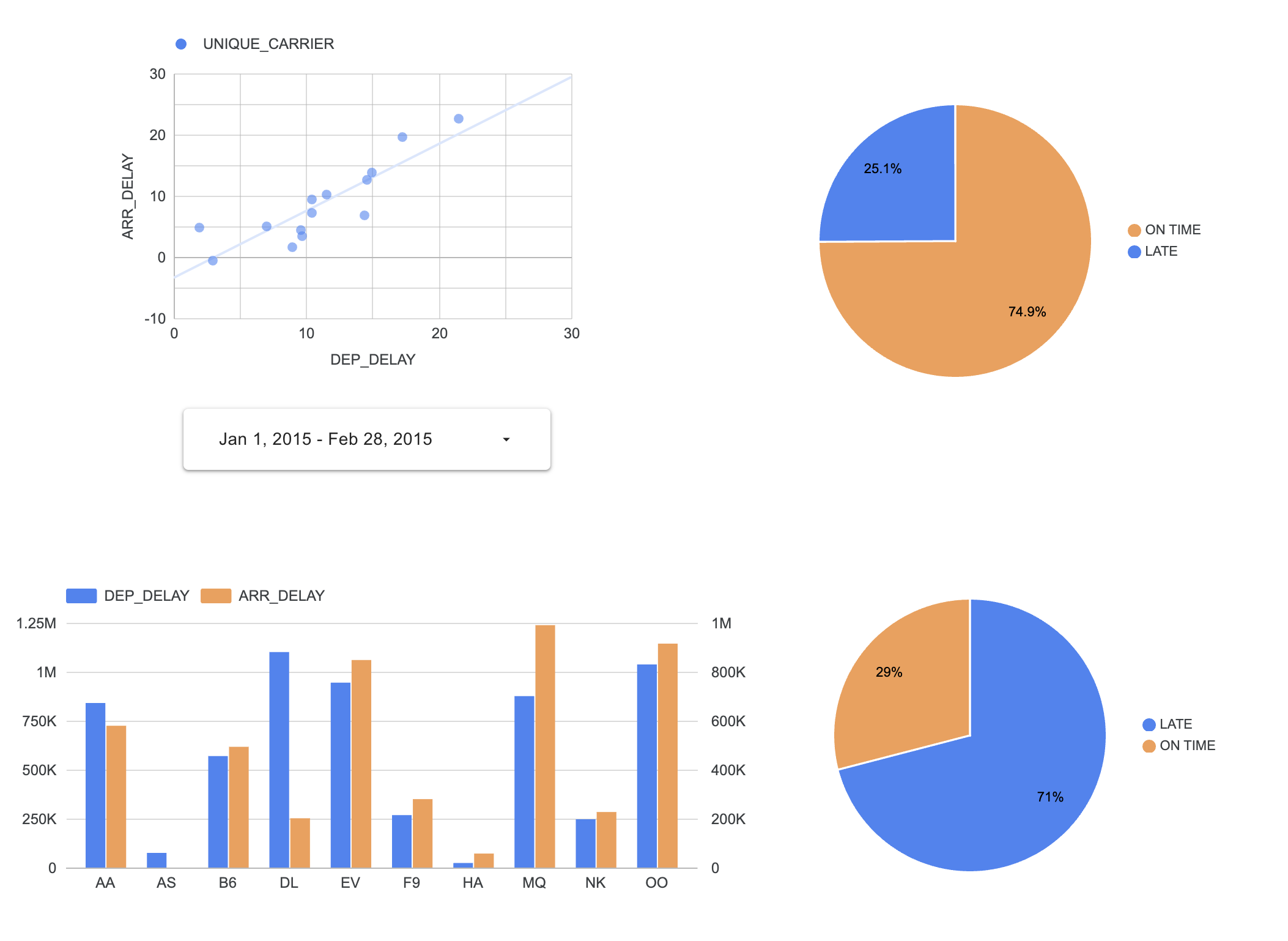
Click Add a chart > Scatter chart, then draw a rectangle on the report canvas to hold the chart.
In the right panel, the Data tab lists the data properties.
| Field | Value |
|---|---|
|
Dimension |
UNIQUE_CARRIER |
|
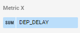
Metric X |
DEP_DELAY |
|
Metric Y |
ARR_DELAY |
Change the aggregation type to Average.
Click outside the aggregation type box to return to the property pane.
Do the same for Metric Y to change the aggregation type from SUM to Average.
Click the Style tab.
In the Style menu, click the Trendline drop-down, and select Linear.
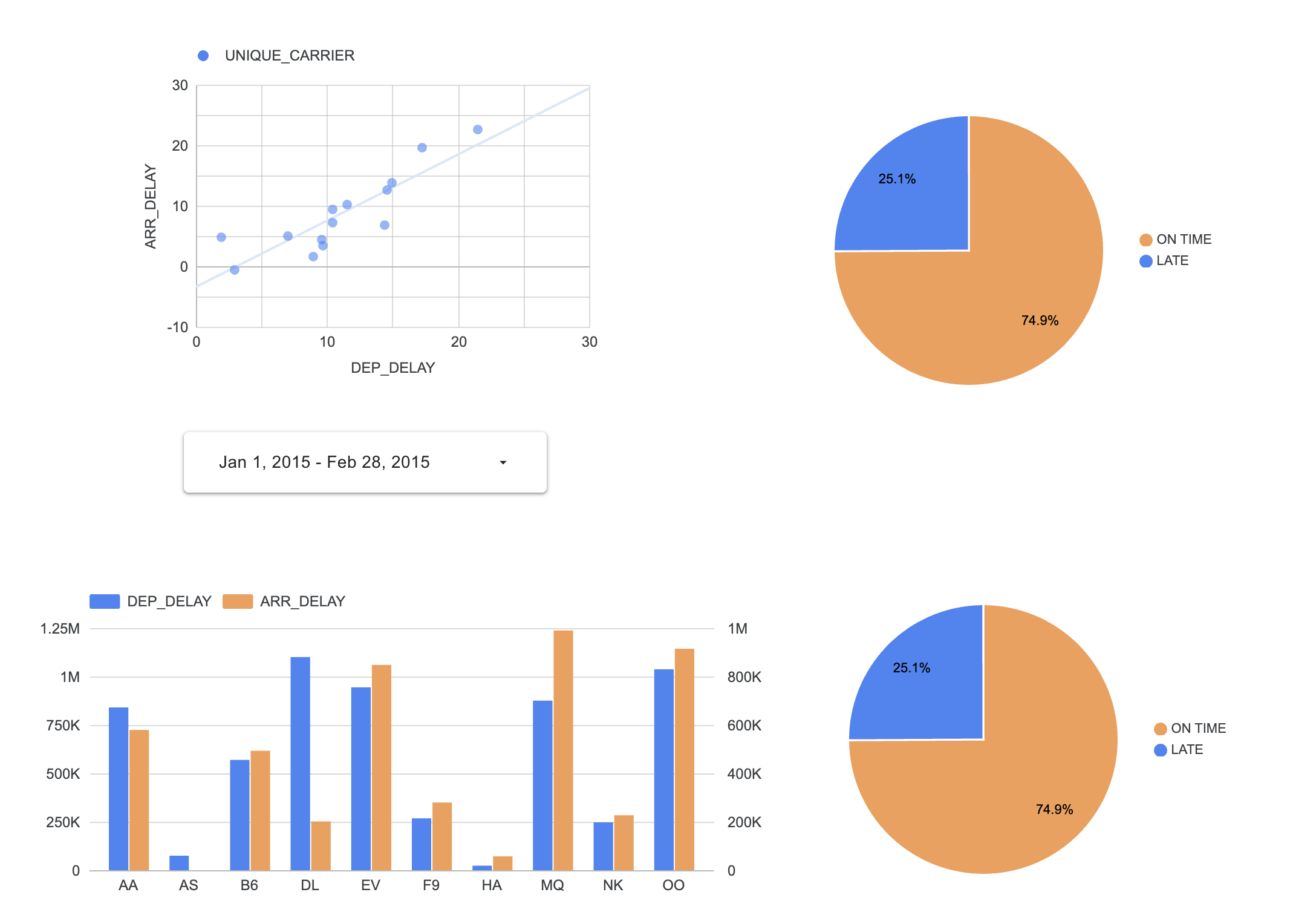
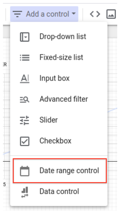
In the ribbon above the report, click Add a control > Date range control.
Click Edit on the upper right to add more chart items.
Click Add a chart > Pie chart, then draw a rectangle on the report canvas to hold the pie chart.
With the pie chart selected, click Add a field on the bottom right of the Data tab in the right panel.
Add a field option, refresh your browser tab.
Click Add calculated field to view the field property summary.
Click All fields to view the field property summary.
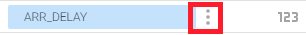
Click the context menu icon to the right of the ARR_DELAY field (three dots) and select Duplicate.
Click Add a field on the top right of the section.
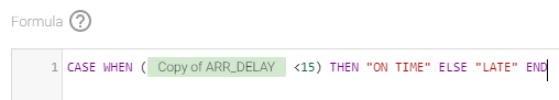
Click Add calculated field and name the field is_late.
In the Formula text box enter the following formula:
The field name must register correctly. If you do not see the syntax highlighting as shown below, double-check the formula or use the Available Fields selector on the right to select the Copy of ARR_DELAY field.
Click Save and then click Done.
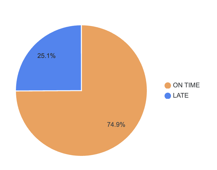
In the Data tab in the right panel, on the Setup tab, change the Dimension for the Pie chart to the new is_late calculated field.
Change the Metric to the new is_late field.
Hover over the CTD icon next the is_late metric.
Click it and change the aggregation to Count.
The pie chart now displays the percentage of on time and late flights.
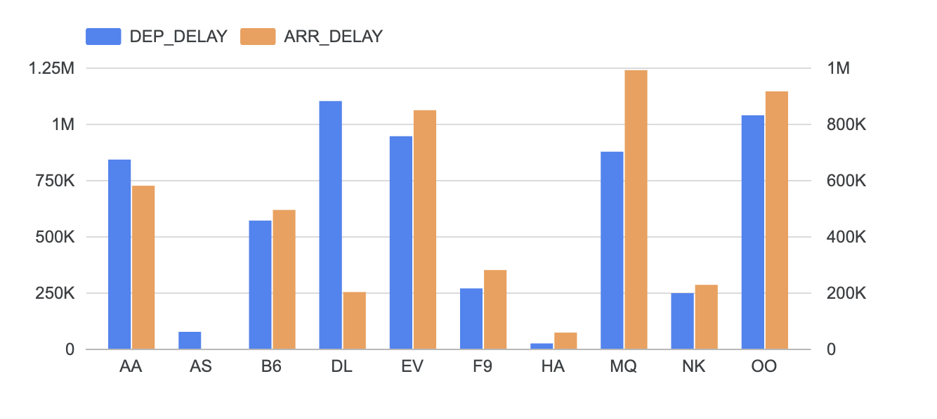
Click Add a chart > Vertical bar chart, and then draw a rectangle on the report canvas to hold the bar chart.
In the Data tab in the right panel, on the Setup tab, click the field for the settings below and change to the following:
| Field | Value |
|---|---|
|
Dimension |
UNIQUE_CARRIER |
|
Metric 1 (Default) |
DEP_DELAY |
|
Metric 2 (click Add metric) |
ARR_DELAY |
|
Sort |
UNIQUE_CARRIER |
|
Sort Order |
Ascending |
In the Style tab, under Axes, change from Single to Double.
Scroll to Left Y-Axis, and set the Axis Min value to 0.
Scroll to Right Y-Axis, and set the Axis Min value to 0.
In a previous task, you created 3 views for delayed times of 10, 15, and 20 minutes. Now you create charts to display the delay thresholds for these tables.
You now have a set of two pie charts. The report canvas should now look similar to this:
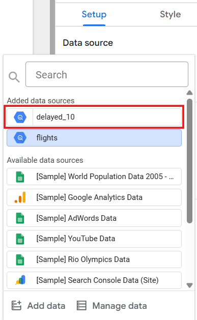
Select the second pie chart, and on the Setup tab, click flights in the Data Source in the property list.
Click Add data at the bottom of the menu.
Click BigQuery in the Google Connectors section of the selection pane.
Select My projects >
Click the delayed_10 table to select it, and then click the Add button on the bottom right of the screen.
Scroll down and click Add a field on the bottom right of the screen.
Click Add calculated field to view the field property summary.
If you cannot see the full list of fields with their data type and Aggregation type displayed, click All fields to go to the field property summary.
Click the context menu icon to the right of the ARR_DELAY field and select Duplicate.
Click Add a field (menu bar above the field names).
Click Add calculated field and name the field is_late.
Enter the following formula in the Formula text box:
The field name must register correctly. If you do not see the syntax highlighting as shown below then double check the formula or use the Available Fields selector on the right to select the Copy of ARR_DELAY field.
Click Save and click Done.
In the Data tab in the right panel, on the Setup tab, change the Dimension for the Pie chart to the new is_late calculated field.
The second pie chart now retains the is_late calculated field and displays the percentage of on time and late flights for the delayed_10 view.
Optionally, repeat the last two sections to add connections to the delayed_15 and delayed_20 views, and create additional pie charts.
You used Looker Studio to visualize data stored in BigQuery tables and views.
...helps you make the most of Google Cloud technologies. Our classes include technical skills and best practices to help you get up to speed quickly and continue your learning journey. We offer fundamental to advanced level training, with on-demand, live, and virtual options to suit your busy schedule. Certifications help you validate and prove your skill and expertise in Google Cloud technologies.
Manual Last Updated March 25, 2026
Lab Last Tested March 25, 2026
Copyright 2026 Google LLC. All rights reserved. Google and the Google logo are trademarks of Google LLC. All other company and product names may be trademarks of the respective companies with which they are associated.


현재 이 콘텐츠를 이용할 수 없습니다
이용할 수 있게 되면 이메일로 알려드리겠습니다.
감사합니다
이용할 수 있게 되면 이메일로 알려드리겠습니다.

한 번에 실습 1개만 가능
모든 기존 실습을 종료하고 이 실습을 시작할지 확인하세요.